Room Repurpose: Guest Room to Urban Safari Studio!
A few months ago I realised that we were really not using the top floor of our house well. If at all.
The extension we had built around five years ago, is comprised of one large and one smaller room - the large one used as my studio, and the small one, a guest room. There's also a decent sized landing, and a small second bathroom.
It had become a very expensive dumping ground, and my studio was utterly out of control - over the years it had become so cluttered that I couldn't bear to be in there except when I absolutely had to, so I'd taken my computer downstairs to the dining room, which inevitably meant my notebooks, pots of pens, paperwork, deliveries, samples and other bits and bobs, started piling up down there and taking over the dining room too. I managed to block out the chaos of my studio by completely ignoring it as much as possible, but the chaos started to spread. Not good!
The dedicated guest room did get used maybe twice a month, but it seemed kind of crazy to have it just sitting there not being used at all the rest of the time.
I'm so incredibly lucky to have all this space, and there really isn't an excuse to not use it properly. I guess I let the chaos get the better of me for a while and I buried my head in the sand, but the guilt eventually crept in, and something really had to give.
It dawned on me that we should sacrifice the dedicated guest room, and turn the larger of the rooms (currently my studio) into a second living area that would also double as a guest room when needed. Somewhere we can snuggle up to watch movies on the weekends, and for the kids to hang out in as they get older and want to have friends over, but not be right under our noses downstairs. I know - lucky kids.
And my studio will be relocated to what was the guest room.
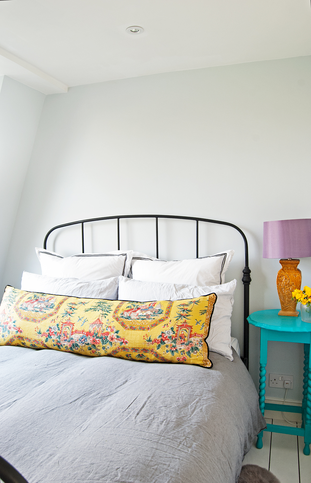
This is what the guest room looked like when it was completed not that long ago. It was not in need of a makeover, but it's definitely time to make better use of the space...


It's a relatively simple swap and repurpose on paper, but in reality, it's quite a big project, mainly due to the fact that there is so much jammed into my studio, and I'm moving into a much smaller space. Argh!
Oh, and of course I want to completely redecorate both rooms before anything moves.
A few weeks ago I sold the spare bed and mattress, and relocated all the things that were being stored under the bed.
The plan is to redecorate before moving anything in from the old studio, as the floors need a refresh too. The walls, woodwork and ceiling will all be painted the same colour - something I've wanted to do for a while, but never plucked up the courage before.
Then everything can come out of the old studio into the new one before I get to work with yet more redecorating! Yep, I have a very busy few months ahead, but I'm so excited about these projects!
I'm struggling with the fact that I can't just make my new studio a really pretty room, and leave out all the not so pretty bits. But alas, it also needs to house practical storage, packaging materials, the printer etc, but I guess that should just spur me on to get rid of everything I no longer need, so it can be as nice as possible, whilst still functioning as my studio.
I'm lucky that I'll get to cheat a little (okay, a lot), as there is space on the landing to house my big Ikea unit which is full to bursting, at least for now, which takes the pressure off a bit because I still have a way to go with the de-cluttering! That said, I've donated, sold, given away and thrown away a HUGE amount of stuff already, which has been most satisfying.
I have my heart set on a lovely new desk like some that I included in a
post several months ago, but I've been pouring money into the house recently, and I just don't have the funds for my dream desk right now. But I put it on the moodboard anyway, because it's way prettier than what I've actually got, and it's good to visualise how you'd like things to look eventually, even if it's not going to be immediately. Meanwhile, I'm also looking out on ebay for something that fits the bill with a much lower price tag, but in reality, I might be stuck with my white Ikea desk for a while longer. Boo!
Rather than spending a fortune, I'll be borrowing some things from other rooms of the house to up the pretty factor. I have however, treated myself to a fab new desk lamp and rug. There isn't going to be much room for any more pretty bits other than as many plants as I can shoehorn in - I'll make my desk area as lovely as possible and the rest, well it will look like exactly what it is - a working home studio.
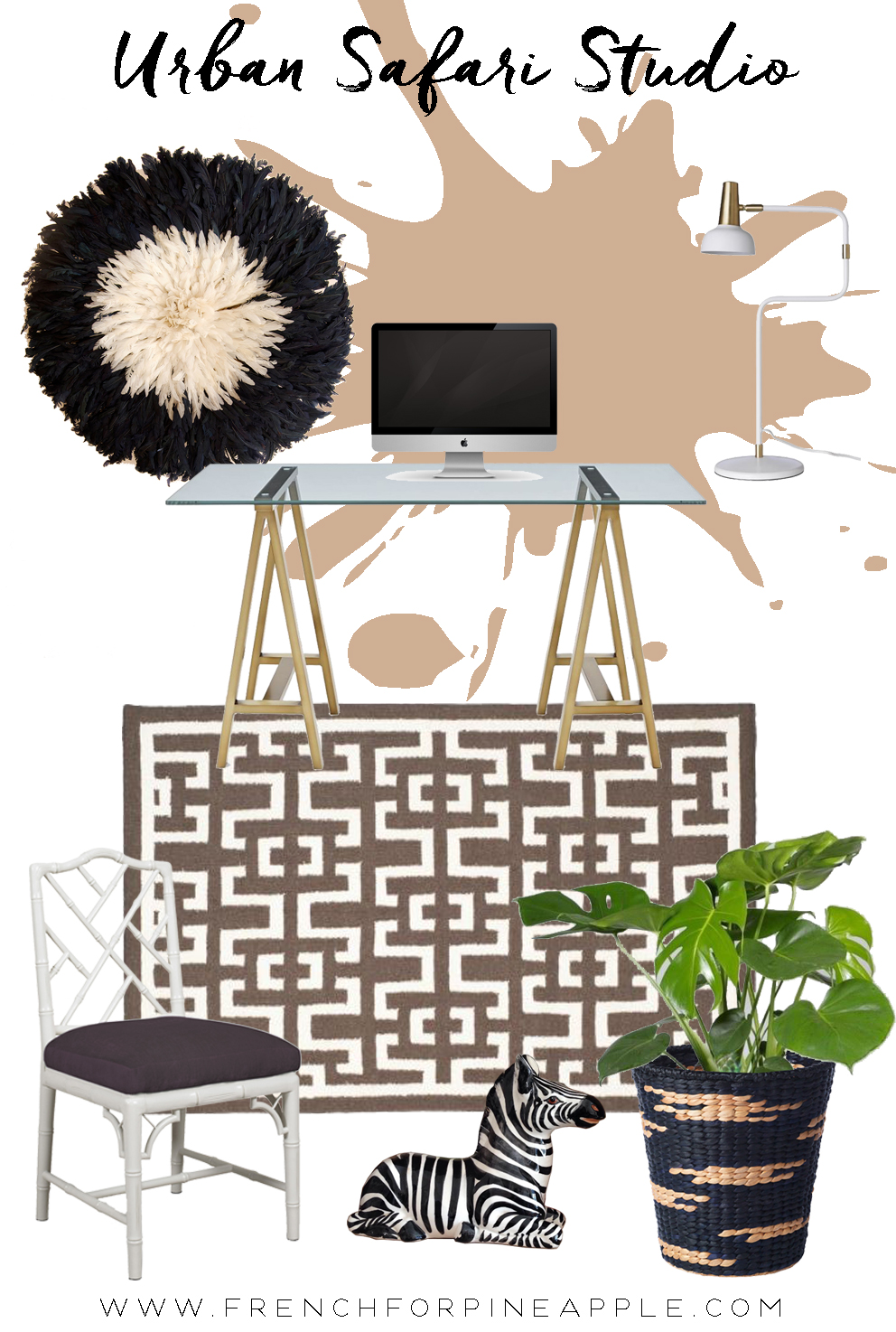
So here's the moodboard! It's kind of Glam Urban Safari meets Mid Century.

Initially I'd planned to go with a bright coral - a colour I really adore, but it's not a huge room, and I don't think such a bright hue would be particularly great for me concentration wise - I get distracted so easily, and decided that a warm, calming colour would be a much better choice for a room where I need to focus.
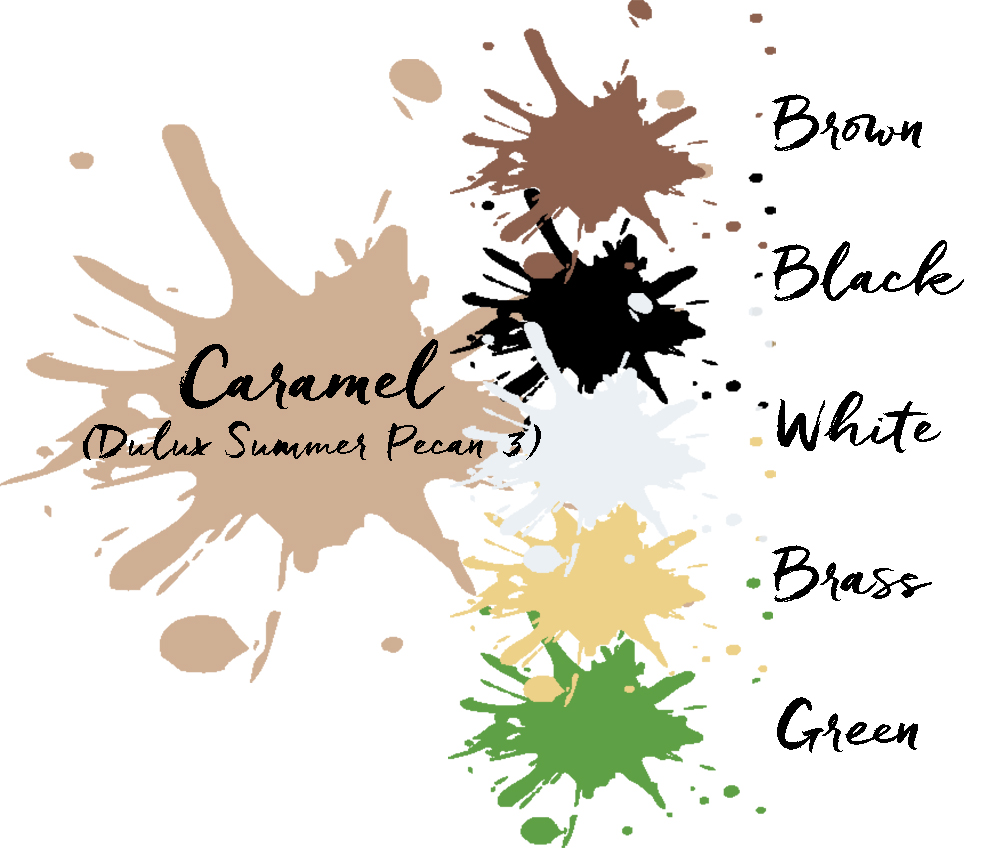
So I started looking at tans and caramels which I'm utterly obsessed with right now, and decided on
. It's so warm and inviting, which is what I love about these colours. I'll be using the Dulux Endurance+ paint, which is super durable (twenty times tougher than their conventional matt paint). So it'll be great for a room that will not only get visits from small people with often sticky grubby hands, but will also see a fair few boxes coming and going. The walls in our house get a tough time, so I really need the paint to be durable!
I often start a room design with a colour in mind and see where it leads me, so having decided on Summer Pecan 3, I got to work on my moodboard, keeping it calm by sticking to a natural palette of browns, caramels, black and warm white.
I loved the idea of my juju hat against the caramel walls, and voila, a soft chic tribal look emerged. I’ll add lots of plants for some colour and the odd brass accent. Of course.
This is not the look I had initially set out to achieve, but I’m so happy with where I’m heading now with this room. It’s actually a much more classic and timeless look than what I originally had in mind, and I can't wait to share the finished room!

In the next few weeks I'll share my plans for the TV room, and I'll hopefully have made some progress on the studio relocation by then too. Right now I can't imagine it actually happening, but it has to because there's the small matter of a MASSIVE sofa turning up any day now for the TV room!
Make sure you're following me on
because I'm always sharing snippets of what I'm up to there - you might just get some sneak peeks there before they make it to the blog.
This is a sponsored post in collaboration with
. You know how much I love paint!
