Room Repurpose: Studio to Family TV Room!
I'm SO excited to share these plans with you today, as they've been in the pipeline for a few months now.
Recently I wrote a post about my plans to repurpose, and breathe some life back into the top floor of our house, starting with moving my studio into what was a guest room. You can read all about that
.
My chaotic studio is no longer - I've had a HUGE clear-out, and my studio has now been relocated, with the overspill currently being housed on the landing.
is now an organised uncluttered calm space and I absolutely love it!
The big room that was my studio, is going to be a second living room where we can relax and watch films on the weekends, the kids can escape to watch their own movies, and hang out with their friends, and it will also double as a guest room when needed. I'm hoping that Baxter will want to make it a place to chill out after school and do some drawing whilst I try to sneak a bit more work in in my studio next door. It's a beautiful big(ish), light room, and we've never really used it well.
It makes so much more sense to use the space this way, as we just don't need a dedicated guest room 24/7. I don't know why it didn't occur to me to use the rooms this way before, but I'm so pleased it has now - we'll finally be using the whole house properly! It'll be so lovely, and will also make the perfect peaceful reading spot. I can't
wait
to get it finished.
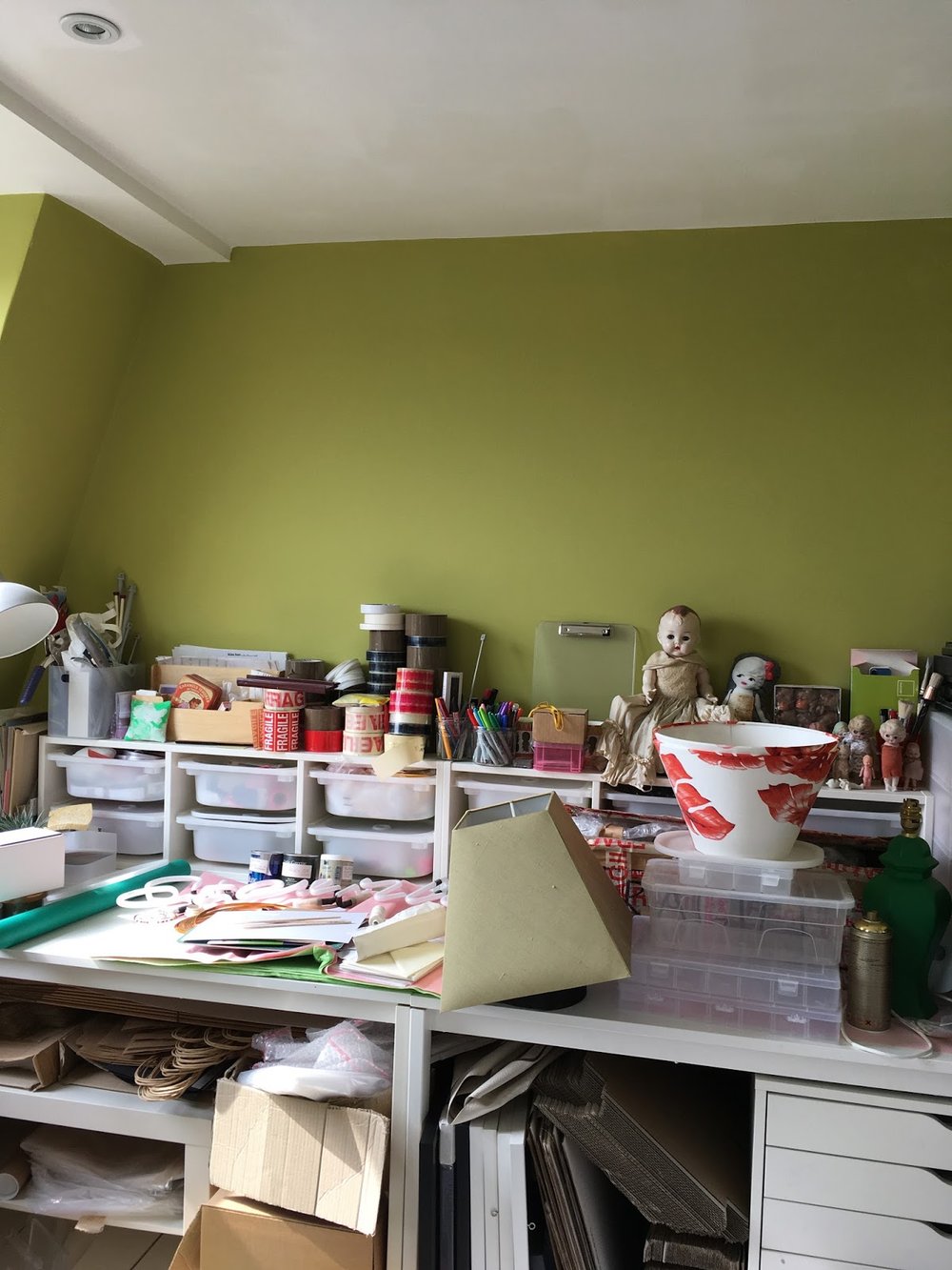
I've never shared my old studio on the blog before, because it was always such an extreme mess - definitely
not
a pretty room. Not only was it a mess, but it had become a major dumping ground, and I was embarrassed it had gotten so out of control. But I have managed to drag myself back from the edge of no return, and I am SO pleased. So yes, go ahead and tut, gasp and judge me, for I deserve it.


I had actually already begun the clearing out process when these photos were taken. Prior to that, you could literally not get into the studio at all. Note the absence of a computer on the desk - I couldn't stand to be in there, so used to work from the dining room table instead!
Here's the moodboard to give you an idea of what I'm hoping to achieve; a serene, laid-back, multi-purpose room...

I had a piece of blue House of Hackney Palmeral velvet that I'd forgotten about, that I rediscovered when clearing the studio, and with it's beautiful blues it became the inspiration for the colour scheme. I wanted the room to be relaxing during the day, and cosy and enveloping at night. But I didn't want to use a navy blue, because I've used that before elsewhere in the house (it's against my rules to use the same colour twice!), and it can feel a bit cold, so I decided to look at teals instead.
After several tester pots, I knew I'd found 'The One' when I put
on the wall. With a big dose of yellow, it's anything but cold, and it's just the right side of murky and muted to keep it looking sophisticated rather than primary, in-your-face-bright.
It perfectly fits the bill of feeling fresh during the day, and cosy at night, and importantly works beautifully with my inspiration fabric.
With the addition of a brand new big modular sofa that fits perfectly in one end of the room and will double as a guest bed, some brass accessories and a couple of plants, this room is set to become my new favourite spot in the house. I'm fickle like that.
This room will be finished in a couple of weeks time, and of course I'll share the results with you right here, so stay tuned!
This post is in collaboration with
.
