Bathroom Debrief From Salone del Mobile with C.P Hart
Last week I attended Salone del Mobile with C.P Hart bathrooms, alongside their Design and Merchandising teams to explore the vast bathroom sector. And I mean vast. It was the first time I'd been to Milan Design Week or the fair itself, and it was mind-blowing. In a good way!
Although I'd been told about the size and how much walking I'd do, I really didn't grasp the sheer scale of it until stepping foot inside the first pavillion. Some 243 bathroom exhibitors set up their stands in a 20,600m2 area. And yes, that's just bathrooms. We visited some truly stunning exhibits, so it's only fair that I report back with a bit of what I saw, which was an unfathomable amount of bathroom goodness!
Next week I'll take you beyond bathrooms, and out and about on the streets of Milan for my Fuori Salone highlights. Though I know for a fact I barely scratched the surface, even after covering 39 kilometres in under three days.
Yes, I had sore feet, and no, I didn't choose the most sensible shoes.
Now, back to bathrooms...
The bathroom is no longer a place to get in and out of as quickly as possible. It’s morphing into another room of the home, and not somewhere for practical use alone.
Bathroom trends are pointing towards creating comfortable, inviting and layered spaces that are to be enjoyed and lingered in, not clinical spaces that you can’t wait to leave. They're becoming more important, private sanctuaries, places to really take some time out for personal wellbeing.
Of course many of us don’t have the luxury of huge bathrooms with space to hang-out, but a sense of luxury can still be achieved in the smallest of spaces if you use the right materials.
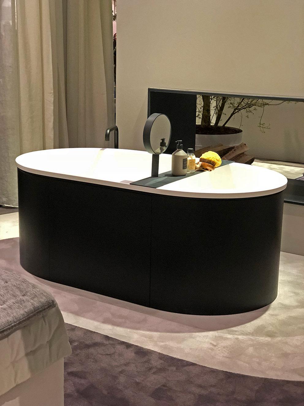
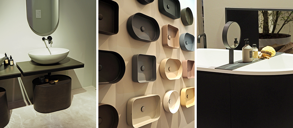
Prominent bathroom trends at Salone del Mobile during my trip with C.P Hart were warm pale neutrals (also echoed in other sectors, not just bathrooms), notably at leading luxury ceramics brand Cielo, where colour played a small subtle supporting role, and matt, chalky neutral ceramics reigned supreme.
Warm metallics are very much here to stay, which came as no great surprise, with a huge selection of finishes now available from the likes of Dornbracht, Samuel Heath and Gessi.
From satin brass to matt black, polished nickel, copper and dark platinum, these brands offer so many stunning brassware finishes. We also spied the odd matt white tap - more of those to come I think. We will never go back to just one brassware finish option again, so it's pretty exciting times!
Artelinea and Duravit know a thing or two about blurring the bathroom boundaries with free standing furniture, which without the basins and taps, would not look at all out of place in a living room or bedroom. Not only do these free standing pieces help a bathroom to flow from the rest of the house, but pieces that are wall hung or on legs, also help to increase the feeling of space.
The stacked tile laying pattern, or as we like to call it the interior obsessives club, the Mandy Moore, was very much order of the day, signalling that herringbone and chevron patterns, should now be left for wooden flooring, and no longer used for tiles.
Colour, or rather the absence of it, was noted, although there’s always an exception to the rule, as boldly demonstrated by the one and only India Mahdavi in her Bisazza collaboration, giving a fun, tongue-in-cheek nod to bathrooms of bygone days, with new takes on the avocado, peach and powder hues of the fifties and sixties.
Where we did see more colour, blues, greens and pink still ruled, and I was surprised not to see more lilac. Maybe next time.
Layering textures brings warmth and softness to what is traditionally seen as a colder room full of hard surfaces, and what better way to demonstrate that point than with these amazing Bette baths. The studded textured surface, the fabric cladding and chalky matt finishes are so tactile and inviting.
Overall, classic satin brass, mixed with rounded white ceramics as seen at ext were a big deal, and something we’ll continue to see in bathrooms as the trends trickle down to the high street over the coming years.
I've returned full to the brim of bathroom inspiration, so it's probably about time I started planning my long awaited bathroom makeover!
Thank you to C.P Hart for taking me on this magical adventure to Salone del Mobile. You can see C.P Hart's trend report here.
Milan Design week, you are magical. See you next year!
This post is in collaboration with C.P Hart
Although I'd been told about the size and how much walking I'd do, I really didn't grasp the sheer scale of it until stepping foot inside the first pavillion. Some 243 bathroom exhibitors set up their stands in a 20,600m2 area. And yes, that's just bathrooms. We visited some truly stunning exhibits, so it's only fair that I report back with a bit of what I saw, which was an unfathomable amount of bathroom goodness!
Next week I'll take you beyond bathrooms, and out and about on the streets of Milan for my Fuori Salone highlights. Though I know for a fact I barely scratched the surface, even after covering 39 kilometres in under three days.
Yes, I had sore feet, and no, I didn't choose the most sensible shoes.
Now, back to bathrooms...
The bathroom is no longer a place to get in and out of as quickly as possible. It’s morphing into another room of the home, and not somewhere for practical use alone.
Bathroom trends are pointing towards creating comfortable, inviting and layered spaces that are to be enjoyed and lingered in, not clinical spaces that you can’t wait to leave. They're becoming more important, private sanctuaries, places to really take some time out for personal wellbeing.
 |
| Cielo (Image: Bianca Hall) |
Prominent bathroom trends at Salone del Mobile during my trip with C.P Hart were warm pale neutrals (also echoed in other sectors, not just bathrooms), notably at leading luxury ceramics brand Cielo, where colour played a small subtle supporting role, and matt, chalky neutral ceramics reigned supreme.
 |
| Cielo (Image: Bianca Hall) |
 |
| Cielo (Images: Bianca Hall) |
Warm metallics are very much here to stay, which came as no great surprise, with a huge selection of finishes now available from the likes of Dornbracht, Samuel Heath and Gessi.
From satin brass to matt black, polished nickel, copper and dark platinum, these brands offer so many stunning brassware finishes. We also spied the odd matt white tap - more of those to come I think. We will never go back to just one brassware finish option again, so it's pretty exciting times!
 |
| Samuel Heath (Image: Bianca Hall) |
 |
| Samuel Heath Landmark Pure (Image: Bianca Hall) |
 |
| Left: Gessi Rivievo in collaboration with HBA Middle & Right: Gessi Inciso by David Rockwell (Images: Bianca Hall) |
 |
| Gessi Inciso by David Rockwell (Image: Bianca Hall) |
 |
| Left: Dornbracht Vaia Right: Dornbracht Brassware Finishes (Images: Bianca Hall) |
Artelinea and Duravit know a thing or two about blurring the bathroom boundaries with free standing furniture, which without the basins and taps, would not look at all out of place in a living room or bedroom. Not only do these free standing pieces help a bathroom to flow from the rest of the house, but pieces that are wall hung or on legs, also help to increase the feeling of space.
 |
| Artelinea (Images: Bianca Hall) |
 |
| Cerasa (Image: Bianca Hall) |
 |
| Duravit (Images: Bianca Hall) |
The stacked tile laying pattern, or as we like to call it the interior obsessives club, the Mandy Moore, was very much order of the day, signalling that herringbone and chevron patterns, should now be left for wooden flooring, and no longer used for tiles.
 |
| Left: Ex.t Middle: Lithea Right: Elle Decor Millennials At Home (Images: Bianca Hall) |
Colour, or rather the absence of it, was noted, although there’s always an exception to the rule, as boldly demonstrated by the one and only India Mahdavi in her Bisazza collaboration, giving a fun, tongue-in-cheek nod to bathrooms of bygone days, with new takes on the avocado, peach and powder hues of the fifties and sixties.
 |
| India Madhavi for Bisazza (Image: Bianca Hall) |
 |
| India Mahdavi for Bisazza (Image: Bianca Hall) |
Where we did see more colour, blues, greens and pink still ruled, and I was surprised not to see more lilac. Maybe next time.
Layering textures brings warmth and softness to what is traditionally seen as a colder room full of hard surfaces, and what better way to demonstrate that point than with these amazing Bette baths. The studded textured surface, the fabric cladding and chalky matt finishes are so tactile and inviting.
 |
| Bette (Images: Bianca Hall) |
Overall, classic satin brass, mixed with rounded white ceramics as seen at ext were a big deal, and something we’ll continue to see in bathrooms as the trends trickle down to the high street over the coming years.
 |
| Ex.t (Images Bianca Hall) |
I've returned full to the brim of bathroom inspiration, so it's probably about time I started planning my long awaited bathroom makeover!
Thank you to C.P Hart for taking me on this magical adventure to Salone del Mobile. You can see C.P Hart's trend report here.
Milan Design week, you are magical. See you next year!
This post is in collaboration with C.P Hart
